A seldom-remembered detail of the commuter-railroad experience back in the 60s is the prevalence of ‘trade advertising.’ These were posters and car-cards and billboards that you passed but barely noticed in the train car and on the platform.
They didn’t advertise a product per se; they advertised advertising space where you could sell your product.
Catching the train in Bronxville or Cos Cob or New Haven you’d see these ads, often mystifying and surrealistic, lining the station platform alongside the enticements to Broadway plays and musicals:
Gilroy IS Here! The Subject Was Roses. Pulitzer Prize Something.
What? You Haven’t Seen Man of La Mancha (“The Impossible Dream”) Even Once?
 Now, those theatrical posters were straightforward. They were clearly selling something, and you knew what they were selling. Trade ads were different. Unless you were in the business, you might not know what a trade ad was up to. If it was plugging WNEW Radio, you’d probably vaguely imagine it was instructing you, the innocent commuter, to listen to WNEW Radio . . . when actually it was telling ad buyers to buy time at WNEW Radio.
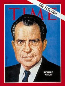
One baffling but long-lived trade series was a Young & Rubicam campaign for TIME magazine. There might be eight or ten of these in a single location.
Imagine you’re walking down a long station platform or concourse, and every few yards you see a mockup of a Time magazine cover. There’s a stark, simple image, and one short line of copy mentioning a Time advertiser. For example, you might see the arm of a chalk-stripe suit surrounded by Time‘s red-bordered branding, and the copy would go:
TIME
Where Brooks Brothers buttonholes the Madison Ave man.
That example is made up; Brooks Bros. didn’t advertise in Time, and they weren’t featured in this outdoor campaign. The fact is, I can’t remember any specific copy at all from this Y&R trade campaign for Time.
This forgettability was sort of intentional. The agency was trying to get Mr Advertising Man to buy space in Time right now, this week, in 1968 . . . they weren’t hoping consumers would go around mouthing a brilliant tagline for the next fifty years.
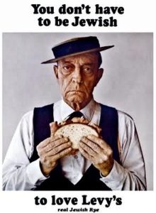 Because that would be tragic. Nothing fails worse than a clever campaign that doesn’t hit the right target. “You don’t have to be Jewish . . . to love Levy’s . . .Real Jewish Rye” is a Y&R line from the era everyone remembers now, though almost no one today eats Levy’s rye bread. I’ve had it recently, so I know it’s still being made.
I suspect the Levy’s campaign was like the Bob and Ray cartoon ads for Piel’s Beer a decade before. They were popular with young and old, and memorable. But they didn’t move beer sales.
But while we remember the Levy’s ads, the Y&R poster campaign for Time does not stick in the public imagination at all. They have in effect been dropped down the memory hole. I’ve been Googling and otherwise researching Advertising Age and Young & Rubicam histories to see if there’s any mention, any image of the Time campaign. No a chance.
I can’t even find online photographs of station platforms where these ads appeared. I guess no amateur archivist ever thought to snap them. It’s almost impossible even to find photos of Broadway posters online. That’s why I show a Playbill above instead of the actual 1964 theatrical poster for The Subject Was Roses.
What does stick in my recollection is that the Time campaign was resolutely upscale. A place to advertise quality products for quality readers. That was the subtext.
This all seems laughable today, when Time is popularly reputed to have been a middlebrow book, and now survives in a scrawny print edition filled with ugly pharma advertising and is subscribed to mostly by 85-year-olds, mainly because they got in the habit of reading it around 1957, back when Time ran real news and half its display ads were for gin and scotch.
It’s a repellent little rag now, but in advertising demographics Time was the class act for decades, far outshining the ad-stuffed Life and Look, which were perceived as picture books that subscribers thumbed through. Readers read Time. Readers read the ads in Time.
 Trade campaigns for other magazines imitated the Time model to a certain extent—e.g., the endless variants of “Forbes: Capitalist Tool,” which made a subtle pitch to the advertisers by flattering the readers. This series, which ran in and around commuter trains in the 1970s and 80s, looked vaguely like a subscription promotion aimed at ambitious young commuters.
But of course the ads were reminding posh advertisers on the train that if they bought space in Forbes they could reach those ambitious young commuters. The kind of people who would read Forbes do not need a train poster to tell them to read Forbes.
The Sunday Giant
The most pervasive and long-lived of the trade-ad campaigns was probably for the downscale, big-circulation Sunday supplement called Parade. “Parade is the Sunday Giant!” went the slogan, generally on a poster or car-card showing a line-drawing cartoon of a towering figure looming over lilliputian newspaper supplements (New York Times Magazine, perhaps?).
 Having mass nationwide circulation was and still Parade’s only real selling point. But advertisers needed to be reminded of this because Parade was easy to overlook. It was and is a one-of-a-kind publication: a bland, friendly downmarket supplement, with content kept so generic it can never seem out of place in Salt Lake City, Sarasota, or St. Louis. This is a difficult trick, and Parade’s done it for, whatever, 70 years? (Look it up!)
Back in the 60s and 70s, every town worth mentioning had at least a couple of big Sunday newspapers, and one of them—generally the one with the better funnies and the shorter editorials—carried Parade. In such locales you’d actually see people in stores and newsstands on weekends, thumbing through the hefty Sunday paper to make sure the sports section and Parade were there! The same way parishioners of St. Catherine of Siena in Greenwich might head for the newsstand after Mass, full of beady-eyed intent to ensure that their Herald-Tribune or New York Times wasn’t missing its Book Review section.
P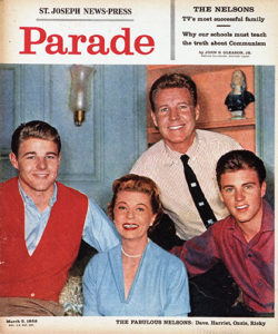 arade emphasized its mass-market, downscale orientation in a dozen ways. In the 50s and 60s, when newspapers boasted of their sturdy newsprint stock and excellent rotogravure processes, Parade went in the other direction and made itself as shoddy as it possibly could. Tabloid-sized and unstapled, its pages were all different sizes, some with rag edges, others cut sharp or with extra dog-ear flaps at the corner. Even on the cover, their color printing was often out of registration, like a 3-D comic book.
Parade left a spot on its nameplate where the local newspaper could print its name or logo, and this just added to the cheap feel: the newspaper’s name was often printed crooked or looked like a rubber stamp.

The editorial matter was mostly filler, dealing with celebrities and fads, the sort of stuff you’d see in a popular Hearst newspaper from the 1920s to 1960s. Advice columns and celebrity gossip figured large. The writing went easily: the words weren’t too big, and the sentences weren’t too long, and the attitude was relentlessly chipper.
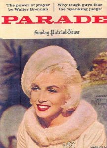
The main rule seemed to be that if you mentioned a celebrity, it had to be someone recognizable to 95% of the readership. That was the secret of “Walter Scott’s Personality Parade,” an inside-cover feature that started around 1971 and still runs today, although Walter Scott himself has no more corporeal reality than Betty Crocker.
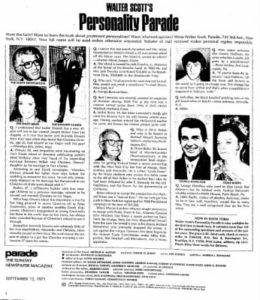 The Walter Scott column was a brilliant addition to Parade, because it ensured that there would be at least one feature that everyone would read. It’s still the first thing you see on the inside: pithy queries and answers about stars and politicians that everybody’s heard of, usually with very upbeat, anodyne answers.
One I remember from circa 1974: “Does Elton John always wear a hat because he’s ‘bisexual’? No, actually he just likes hats! Also he’s having hair transplants!”
Parade’s advertising mechanism I never figured out. Its low-budget, rec-room-floor style could never have been a good fit for most advertisers. (Toothpaste, yes; Tanqueray, no.) Since the same edition was distributed across the country, there was no way it could pick up lavish display ads from retailers or car dealers. Parade survived on cheap ‘n’ cheerful national ads for five-dollar muumuus and anti-itch powder for dogs.
 Their perennial full-page advertisers mostly sold stuff you might never see advertised anywhere else, or at least outside a Sunday supplement. There was Zoysia grass, a magical kind of turf that evidently never needed watering or weeding. And there was a weight-loss candy that had the merry name of Ayds. The latter’s ads were always disguised to look like editorial matter, with a first-person narrative, “As told to Ruth L. McCarthy,” related by a former fat-lady.
(Rumors flew that Ayds contained dexedrine or methamphetamine, but that alas was never the case, and it’s a marvel that the product survived as long as it did. In the 1980s it lost half its business, reportedly because potential customers were scared off by a name that sounded like a killer virus. The manufacturer tried changing the name to Diet Ayds, but that didn’t seem to help.)
One hears sometimes that Parade is a family-run, closely held, business. I find that easy to believe. There’s just enough work here, and just enough money, to support one extended family.